PIGEON
THE PACIFYING COLOURS
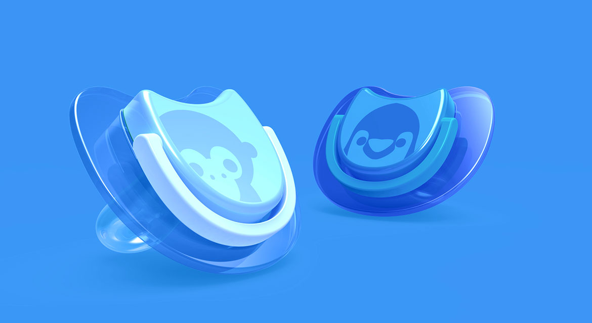
Pigeon, a renowned Japanese brand for baby care products, approached us to devise a CMF design strategy and a strong colour and graphics palette for their range of pacifiers products. Adopting Pigeon’s brand motto and philosophy, we took the design approach to think from a mother’s point of view and look through the eyes of a baby.
THE PROCESS
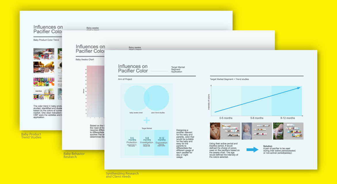
We directed an approach to study the trends and influences on baby products over the EMEA, NAFTA, North Asia and South East Asia regions. We undertook to understand the baby behavioural studies through the awake chart and their reception of colours and icons. We researched on the travelling needs and convenience of the parents and babies to gain insights. We eventually synergized the all research learnings and applied into the target segment of the products for the various age groups.
THE COLOUR MATRIX
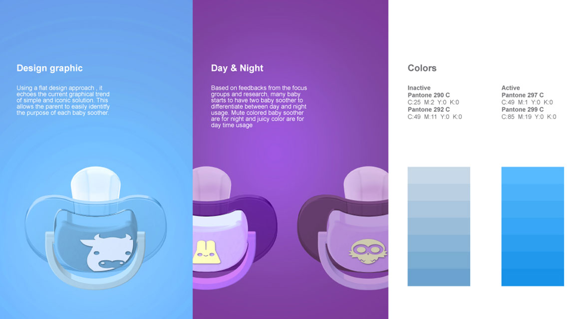
With a flat colour palette, we created a design approach that is soothing for the mother and the baby. In the outdoors, pacifiers were often dropped on the floor by the little ones. The clear colour tones allows the parents to easily identified and remember the dirty pacifiers in their baby bags. For the day and night purposes, we created a muted night colours and juicy day colours for the activeness of the baby. We designed three groups of design characters and graphic elements “Neo-Anime”, “Smiling” and “Geometrica” that added the elements of fun and smiles to the range of colour palettes
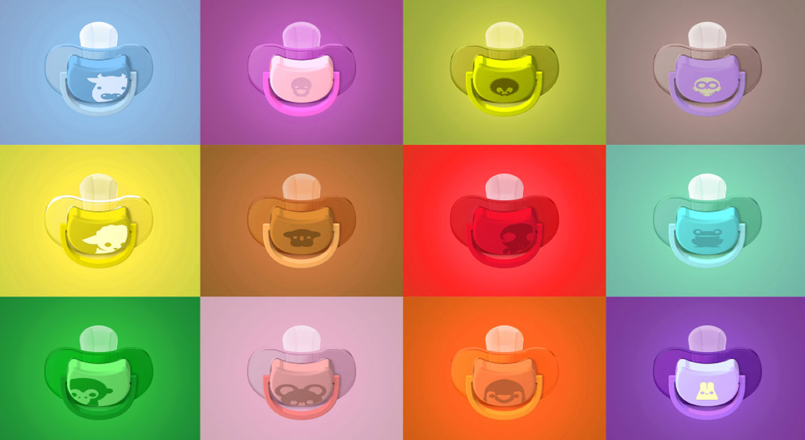
We worked on the full spectrum of colours, materials and finishes and graphic design over the full the range of pacifiers across the three different age categories. We provided all the colour codes and the plotted the possible CMF combinations via a unique colour matrix where Pigeon was able to pick and match different colours for the different genders and age groups.
TYPE
Brand communications, Product Design
INDUSTRY
Baby care, Pacifiers and Teethers
SERVICES
Design Research, Trend Studies, Trends Analysis, Design Strategy, Graphics Design, Character Design, CMF Design